
- 보통 뷰에 특정 배경색 또는 테두리 효과를 주입하는 것은 아래처럼 drawable XML 소스를 구현하면 된다.
<shape xmlns:android="http://schemas.android.com/apk/res/android"
android:shape="rectangle">
    <solid android:color="#00000000"/>
    <stroke android:color="@color/colorPrimary" android:width="1dp"/>
    <corners android:radius="8dp"/>
</shape>
- 하지만 테두리의 경우 그러데이션을 자체적으로 지원하지는 않은 것으로 확인되어 Paint를 활용해 그려서 커스텀 뷰를 구현하는 작업을 진행했다.
class GradientStrokeButton @JvmOverloads constructor(
    context: Context,
    attrs: AttributeSet? = null,
    defStyleAttr: Int = 0
) : AppCompatImageButton(context, attrs, defStyleAttr) {

    private var cornerRadius = 0f
    private var borderWidth = 0f
    private var startColor = 0
    private var centerColor = 0
private var endColor = 0- ImageButton 기반으로 구성을 진행했고, Radius와 선 굵기를 위한 변수를 선언한다.
- 그리고 그라데이션 효과의 시작 - 중심 - 끝 컬러를 각각 지정하기 위한 변수도 선언한다.
private val path = Path()
private val borderPaint = Paint().apply {
    style = Paint.Style.FILL
}- 테두리를 그려줄 path와 paing 선언. 테두리는 내부는 빈틈없이 채워져야 하므로 FILL Style로 지정한다.
init {
    context.withStyledAttributes(attrs, R.styleable.StyledButton) {
        borderWidth = getDimension(R.styleable.StyledButton_borderWidth, 10f)
        cornerRadius = getDimension(R.styleable.StyledButton_cornerRadius, 10f)
        startColor = getColor(R.styleable.StyledButton_startColor, Color.WHITE)
        centerColor = getColor(R.styleable.StyledButton_centerColor, Color.RED)
        endColor = getColor(R.styleable.StyledButton_endColor, Color.BLACK)
    }
}- 뷰의 프로퍼티로 접근 가능한 stylable을 선언한다. attrs.xml에 추가하는 것 또한 잊지 말아야 한다. (없으면 생성하면 됩니다.)
<declare-styleable name="StyledButton">
    <attr name="cornerRadius" format="dimension" />
    <attr name="borderWidth" format="dimension" />
    <attr name="startColor" format="color" />
    <attr name="centerColor" format="color" />
    <attr name="endColor" format="color" />
</declare-styleable>
- onSizeChanged를 구현하여 해당 커스텀 버튼 뷰의 크기가 변할 때, 그라데이션 테두리의 갱신도 이루어지도록 한다.
override fun onSizeChanged(w: Int, h: Int, oldw: Int, oldh: Int) {
    super.onSizeChanged(w, h, oldw, oldh)
    borderPaint.shader = LinearGradient(
        0f,
        0f,
        width.toFloat(),
        height.toFloat(),
        intArrayOf(startColor, centerColor, endColor),
        null,
        Shader.TileMode.CLAMP
    )
}
- 여기서 null 부분인 포지션은 색상의 분포 비율을 의미하며 null일 경우 자동 균등 분배된다.
- Shader.TileMode의 CLAMP는 끝부분을 마지막 색상으로 채워서 반복 효과가 없도록 하는 것이다.
- 이제 onDraw에서 사각형 둘레를 그린다.
override fun onDraw(canvas: Canvas) {
    super.onDraw(canvas)
    path.rewind()
    path.addRoundRect(
        borderWidth,
        borderWidth,
        width.toFloat() - borderWidth,
        height.toFloat() - borderWidth,
        cornerRadius - borderWidth / 2,
        cornerRadius - borderWidth / 2,
        Path.Direction.CCW
    )
    canvas.clipOutPath(path)

    path.rewind()
    path.addRoundRect(
        0f,
        0f,
        width.toFloat(),
        height.toFloat(),
        cornerRadius,
        cornerRadius,
        Path.Direction.CCW
    )
    canvas.drawPath(path, borderPaint)
}- 내부를 클리핑 처리할 둥근 사각형을 먼저 그려준다.
- canvas.clipOutPath(path): 특정 영역을 제외하고 클리핑하여 내부를 잘라낸다.
- 이어서 rewind를 재호출하여 경로 정보를 초기화하고, 그라데이션 테두리를 그린다.
- borderPaint를 통해 Path를 그려주면 내부를 비우고, 그라데이션이 적용된 테두리 보이는 버튼이 완성된다.
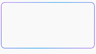
- 아래처럼 XML에서 stylable을 통해 구성 가능하다.
<com.test.component.GradientStrokeButton
    android:id="@+id/gradientBox"
    android:layout_width="400dp"
    android:layout_gravity="center"
    android:layout_height="200dp"
    android:layout_marginTop="20dp"
    android:gravity="center_horizontal"
    app:borderWidth="2dp"
    app:centerColor="#279DF4"
    app:cornerRadius="16dp"
    app:endColor="#AB6FF7"
    app:startColor="#AB6FF7" />